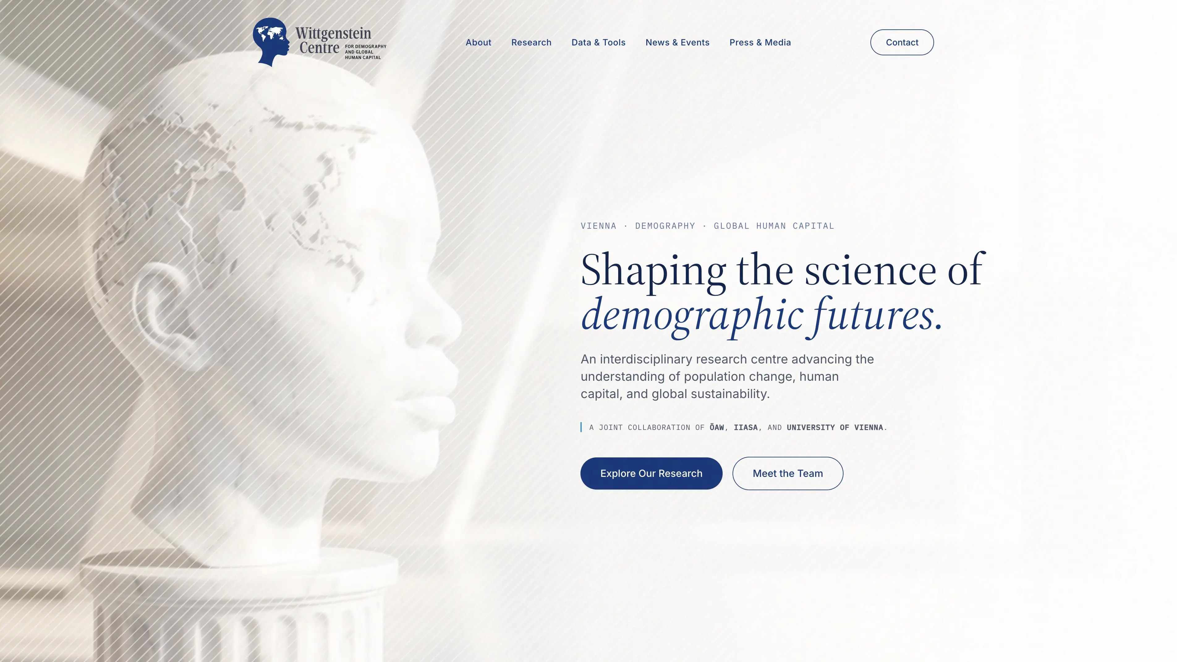
Australia in the Eye
A deliberate design detail: Australia is positioned precisely within the figure’s eye, creating a memorable visual anchor and a distinctive identifier for the brand.
#2F94D1
#514D4C
The “Wittgenstein Centre” typeface is excessively thin and filigree. At reduced sizes – business cards, favicons, printed materials – letterforms become illegible.
“For Demography and Global Human Capital” is not proportionally balanced with the main wordmark. The sizing feels arbitrary rather than deliberate.
A horizontal rule between name and subtitle adds clutter instead of creating visual order. It fails to establish a clear hierarchy.
None of the elements are aligned to any coherent grid. Icon, wordmark, and subtitle each float independently, yielding an unprofessional composition.
#183678#0F224A#3D4252#1C1F26#FFFFFF
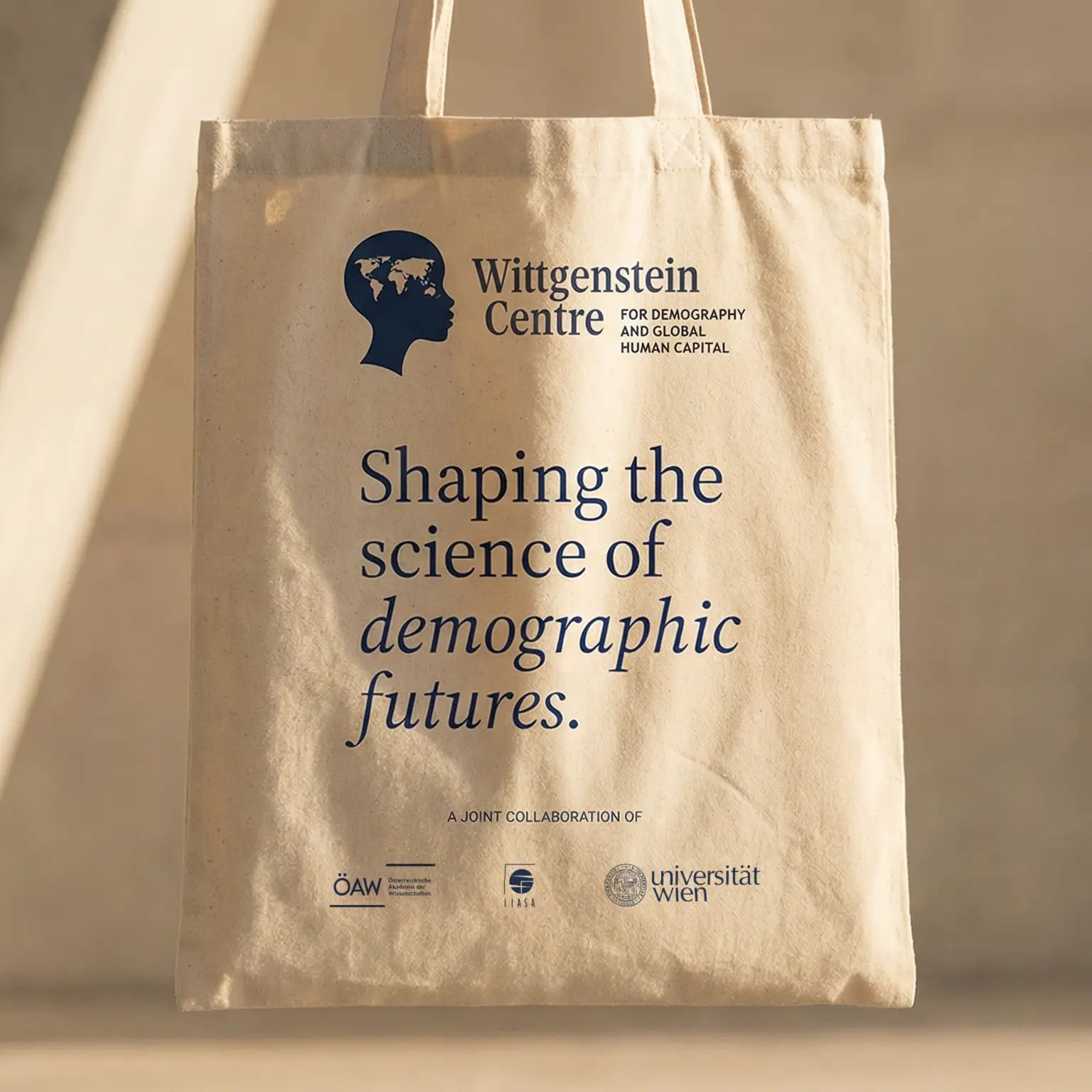
The serif typeface bridges classical scholarship with contemporary design, projecting intellectual authority without feeling dated.
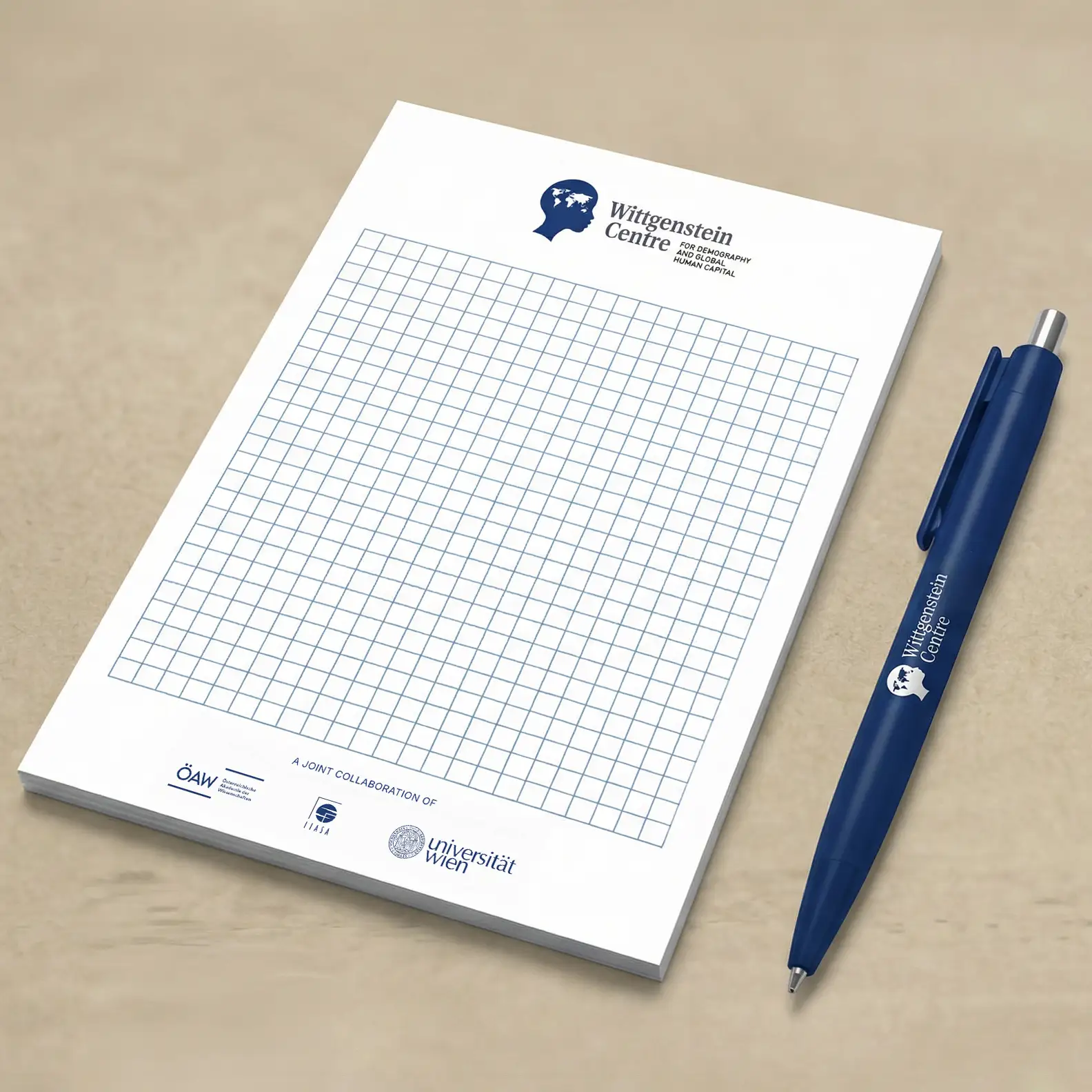
Robust stroke weight and open counters ensure legibility from large-format prints down to 12mm-wide favicons.
The subtitle aligns at the x-height of the main wordmark. Two subtitle lines equal the cap-height of adjacent characters – a proportionally integrated relationship.
At small reproduction sizes, the subtitle drops away. The wordmark and icon stand alone confidently.

A deliberate design detail: Australia is positioned precisely within the figure’s eye, creating a memorable visual anchor and a distinctive identifier for the brand.

The figure’s features have been subtly shifted toward an African woman – a deliberate choice to move away from a Eurocentric default and better represent the Centre’s truly global mission.
The neck and shoulders flow into organic, nature-inspired forms – reminiscent of a classical bust. This resolves the abrupt cut of the old version and gives the icon a complete, dignified presence.